01 | Mission
Our mission is to offer continued job training opportunities, provide economic opportunity through employment, invite the community to our table, and create memorable and remarkable culinary and hospitality experiences for our guests.
Our vision: Making lives better through the power of food.
By engaging the disengaged, helping individuals overcome barriers to employment, and creating neighborhood economic development, we will be a catalyst for breaking cycles of poverty and homelessness, assisting individuals to realize economic opportunities, and transforming our community
fresh / local / sustainable / engagement / hospitality / development / equity / respect / community
02 | Brand Context
We seek HARMONY and honor the spirits of FREEDOM and WONDER as we forge connections feuled x food.
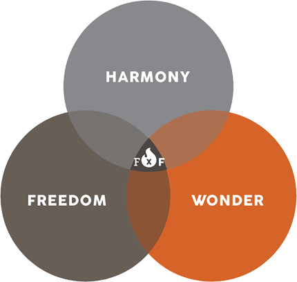
HARMONY : We believe in harmony—a symbiotic relationship that holds us together. It’s a balance that exists in and among nature, society, and people. It’s what you will find at FIRExFORGE in all the refined considerations and details and how they are nested in our patron community, our neighborhood, and our city.
FREEDOM : Between the anchor posts of home and work, is a third space meant for those who move and are not limited by familiarity. It’s a place rooted in freedom to be, to explore, and to engage. We align with an increasingly liberated way to connect with each other and in our community. The spirit of freedom is attracted to us—and we very much vibe in that direction.
WONDER : The big “what if” intersecting with the big “why not”. Wonder is the catalyst for more appreciation, more intrigue, more harmony, and for the daring to be more free. Try it. You’ll LOVE it.
03 | Brand Goal
Develop a RETAIL-ORIENTED BRAND that projects trust, access, and consistent quality while being an invitation for all to join The Fire by Forge energy as it becomes a movement.
04 | Logo
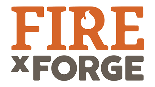
SIGNATURE LOGO
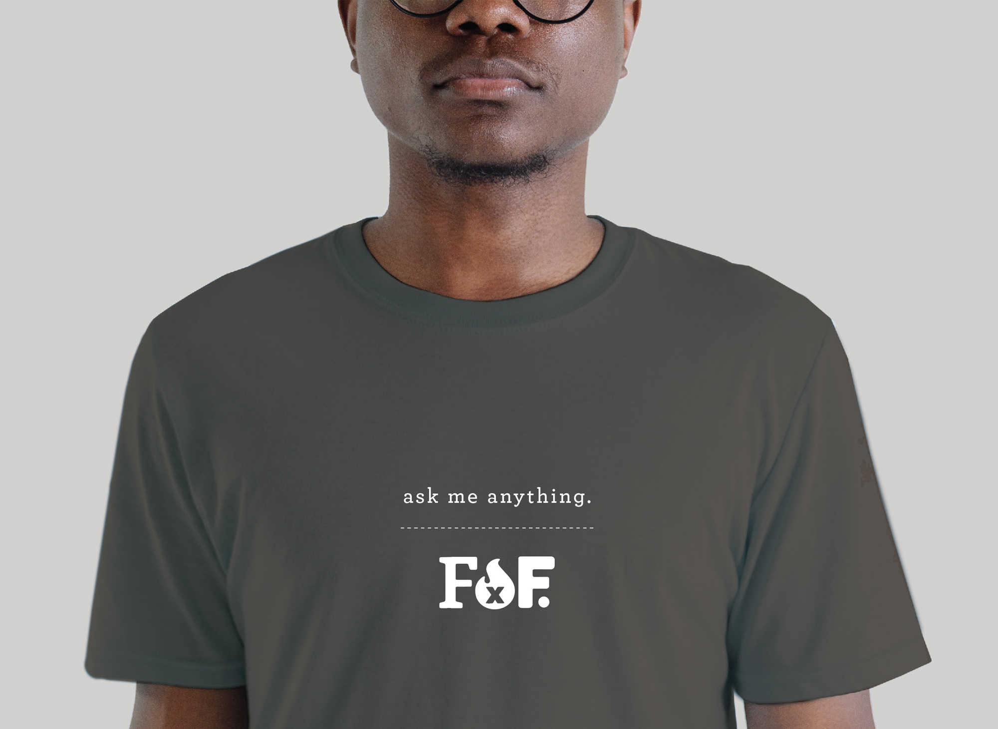
There are two versions of the Fire by Forge logo: the signature logo and the short-hand logo. The signature logo is the main identifier for the brand, particularly on outwardly facing materials. The short-hand logo can be used when the full name is referenced, within the restaurant, or as a purely retail graphic curiosity on items like apparel where the wearer can articulate the connection back to the restaurant.

SHORT_HAND LOGO
Logo Clearspace
Clearspace around the logo is equal to the half of the first cap “F” (Fire).
Exception: Conditions where you do not have control over the clearance (such as social media icons)
Logo Color
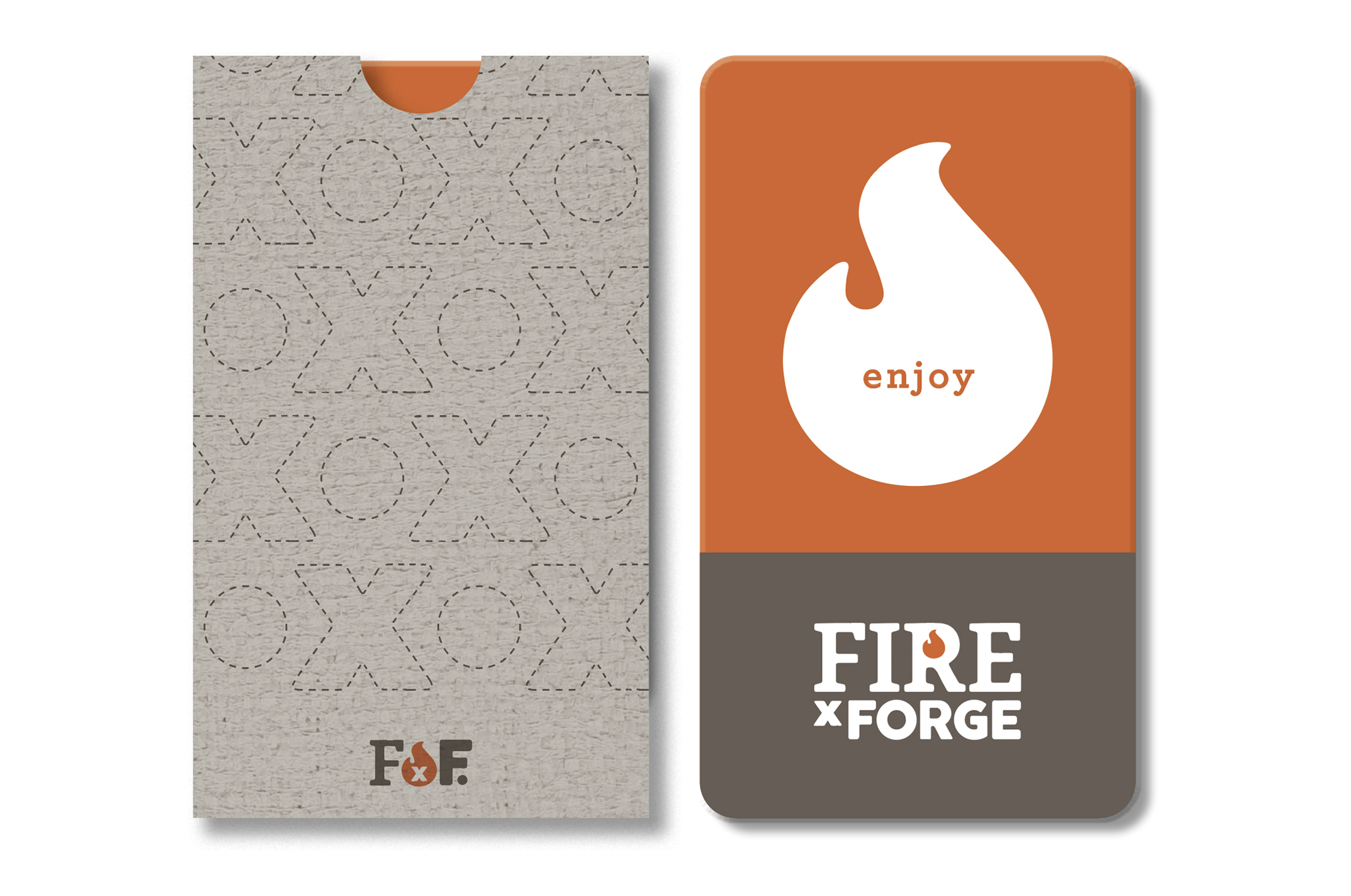
Full color logos should be placed on light color backgrounds. Knocked out logos (white) should be placed on brand color or dark backgrounds.


Logo Use Guidance
- Use the logos in the files provided as provided. Don’t alter those files—they were designed to respond to a broad range of logo applications.
- Be mindful not to stretch, squeeze, or otherwise distort the logos.
- The typography in the logos has been customized extensively. To keep to the brand aesthetic, don’t substitute the typography with any other font.
- Keep to the brand colors provided in the logo color breaks supplied.
- Don’t change the brand identifier in the logo. For example: don’t replace the flame with another object (for example—don’t use a star as the counter of the “R”.
Logo Scale
Smallest size: for web: 108 pixels wide / Smallest size: for print: 1.5 inch wide.


05 | Brand Colors
The brand colors are kept to the two logo colors so the brand can be readily identified. These colors relate to the overall Forge City Works brand and should be used rigorously.

RGB 214 100 40
CMYK 14 73 100
HEX d66428

RGB 103 94 85
CMYK 55 53 60 27
HEX 675e55

RGB 201 202 207
CMYK 21 16 13
HEX c9cacf
06 | Typography
Roboto / Print + Digital
This secondary headline is three lines and set to Roboto Bold 700.
This subhead is half the point size of the headline and set to Roboto Medium 500.
The Body Copy is set to Roboto Book 300—The sans serif font Roboto is used for all of the text type for Fire by Forge. It is used for body copy and subheads. Descriptors such as event titles and menu titles could benefit from a display type. Beyond the display use, Roboto is the go-to type choice for both digital and print uses.
Archer / Print
Main titling is set in Archer Light.
Smaller titles can be set in Archer medium for contrast emphasis to body text (rare application).
EMPHASIS TO BODY COPY. This would be set in Archer bold if contrast/offset is needed from simply using a bolder version of Roboto.
Roboto Slab / Web

