01 | Mission
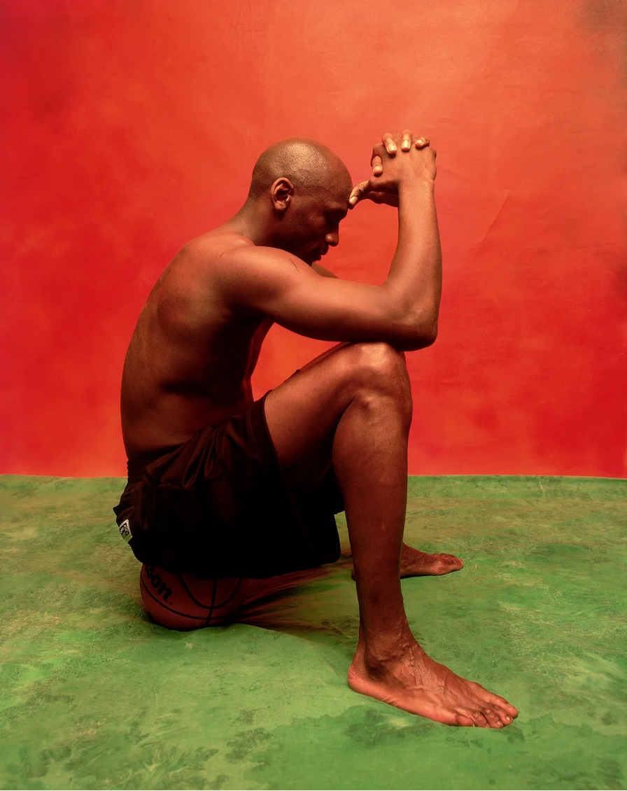
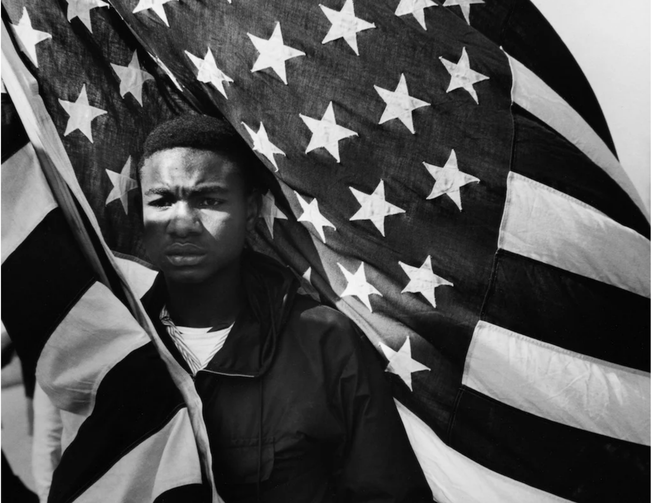
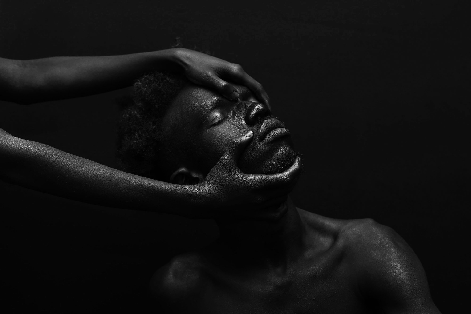
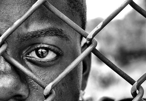
Create provocative theater that connects our community beyond traditional barriers of race, gender, class, and geography.
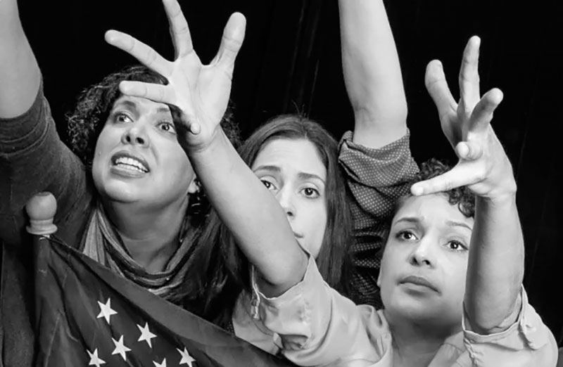
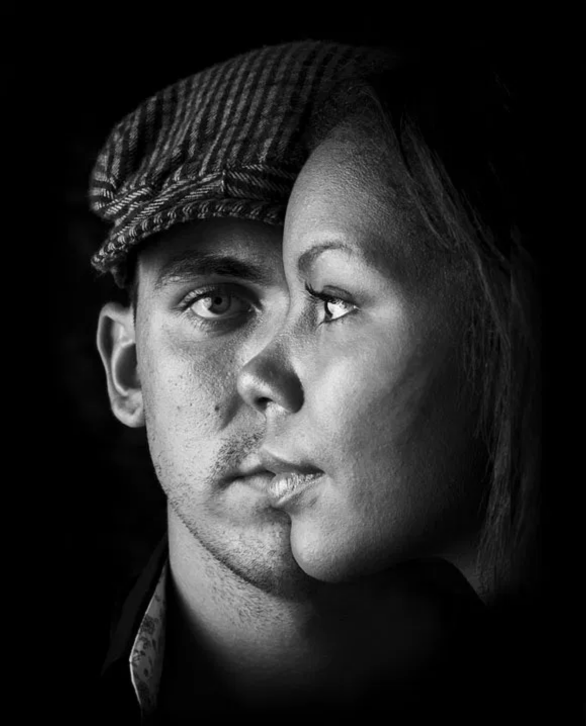
↑ “Gross Domestic Product” is about women in the workplace. Playwright by Julia Rosenblatt.
02 | Brand Context
HartBeat Ensemble: A Catalyst for Liberation.
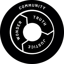
HartBeat Ensemble’s work is in, with, and through the community. Essential to this work is our shared sense of wonder with our participants. Wonder brings us together ready to engage. Through that curiosity, truths emerge that are specific to our community. The uncovering of truths prompts an increase in activism throughout our community with the goal of yielding more and more justice. Through our work, we recognize that a community uplifted by the power of justice finds itself open to more wonder yielding more truth and again more justice in a virtuous circle until justice achieves its goal: liberation. The spirit of this cycle—the simple beauty and raw disruption of it—is at the heart of the HartBeat Ensemble brand.
03 | Brand Goal
Our challenge to everyone building the HartBeat Ensemble brand: let’s use our platform to inspire trust while maintaining an attitude of discovery, and delivering both professionalism and intimacy. This is what sets our brand apart and it’s an attitude that helps us participate in the change we believe in with integrity and humility.
04 | Logo
The logo, itself, is an ensemble where the core pieces—the Heartbeat and the Ensemble—are in clear relationship with each other. This bold simplicity allows the mark to transform into additional ideas expanding on the intention of our brand.
Icon Construction
Our logo is based on two simple type-based shapes carefully crafted for legibility at any size on any application.
Logo Clearspace
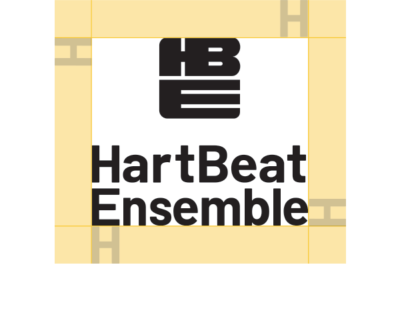
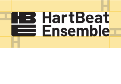
Clearspace around the logo is equal to the cap height of the letter H.
Logo Clearspace Exceptions
The logo placement depends on the type of communication and use.
Application icons
Social media icons
Logo Color
Logo should be white on darker backgrounds and black on lighter backgrounds.
Horizontal Logo Scale
Smallest size: for web: 108 pixels wide / Smallest size: for print: 1.5 inch wide.
Vertical Logo Scale
Smallest size: for web: 108 pixels wide / Smallest size: for print: 1.5 inch wide.
Logo Guidance
Don’t stretch the logo.
Don’t use the logo in color.
Don’t use other fonts.
Don’t pair the logo with marks other than the HBE icon(s).
05 | Program Logos
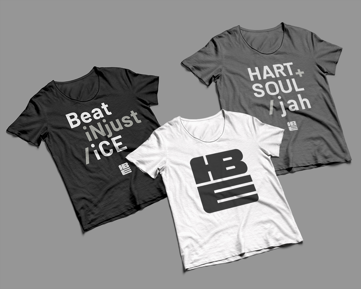
The HBE icon transforms to identify the full range of our offerings.
HartBeat Repertory
A diverse program of contemporary, classic, and ensemble created political plays that represent the multiplicity of cultures at the heart of Hartford.
HartBeat Presents:
A curated performance series, of contemporary and socially pertinent work by local, regional, national artists/companies.
HartBeat Forum
Often in partnership with civic or social organizations—HartBeat uses theater, performance and facilitated dialogue to engage the community about a specific topic and/or geographical location (Migration 360°).
HartBeat LifeLong Learning
A series of professional paid internships for youth ages 16-21 in play creation; new program of anti-racism training for K-12 and higher education teachers and administrators.
HartBeat Additional Program Icons
06 | Brand Colors
Our primary brand colors are black and white. They provide accessibility, simplicity, and consistency throughout all brand communications.
Primary Colors:

RGB 0 0 0
CMYK 70 35 40 100
HEX 000000
PMS Black 6C

RGB 255 255 255
CMYK 0 0 0 0
HEX ffffff
PMS White
Secondary Colors:

RGB 157 153 148
CMYK 41 35 38 1
HEX 9d9994
PMS Cool Gray 6C
PMS Cool Gray 6U

RGB 80 138 142
CMYK 71 32 41 4
HEX 508a8e
PMS 7459 C
PMS 630 U

RGB 135 156 100
CMYK 51 25 73 4
HEX 879c64
PMS 7495 C
PMS 7494 U

RGB 222 175 51
CMYK 14 30 94 0
HEX deaf33
PMS 7406 C
PMS 7406 U

RGB 192 72 39
CMYK 18 85 100 7
HEX c04827
PMS 7417 C
PMS 7417 U

RGB 214 125 157
CMYK 13 62 17 0
HEX d67d9d
PMS 7423 C
PMS 7423 U
07 | Typography
Our primary typeface is Barlow. It’s a slightly rounded, low-contrast, grotesk type family designed by Jeremy Tribby and available as Google Fonts.
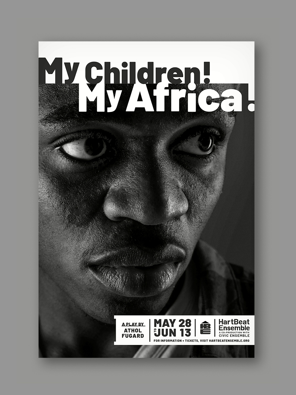
Additionally, two ancillary typefaces, Crete and Averia Serif Libre, have been selected as typographic elements for “display headlines” (poster headlines, for example). These secondary type options are supplied to achieve the exact tone of a designed piece when Barlow doesn’t deliver the nuanced goals of a HarBeat Ensemble program. We do believe that Barlow will serve well for foreseeable instances—so do the best you can to resolve your design with the primary typeface.
Primary Font: Barlow
This headline is three lines and set to Barlow Black 900.
This subhead is half the point size of the headline and set to Barlow Bold.
The Body Copy is set to Barlow Regular — Barlow is a slightly rounded, low-contrast, grotesk type family designed by Jeremy Tribby. Barlow is free, open source software. Pa nist acea dipsam ra velest aut evellaboria sed ut excepudanis evendia solorendis maio. Iditatus etur, quis rem esed qui necupieni beatem sitatur molorrore comnitatus esti aspedit.
Secondary Font: Crete Round
This font is Crete Round Normal and it is to be used when necessary for the play titles on the posters.
Secondary Font: Averia Serif Libre
This font is Averia Serif Libre and it is to be used when necessary for the play titles on the posters.
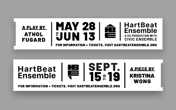
The Poster Banner:
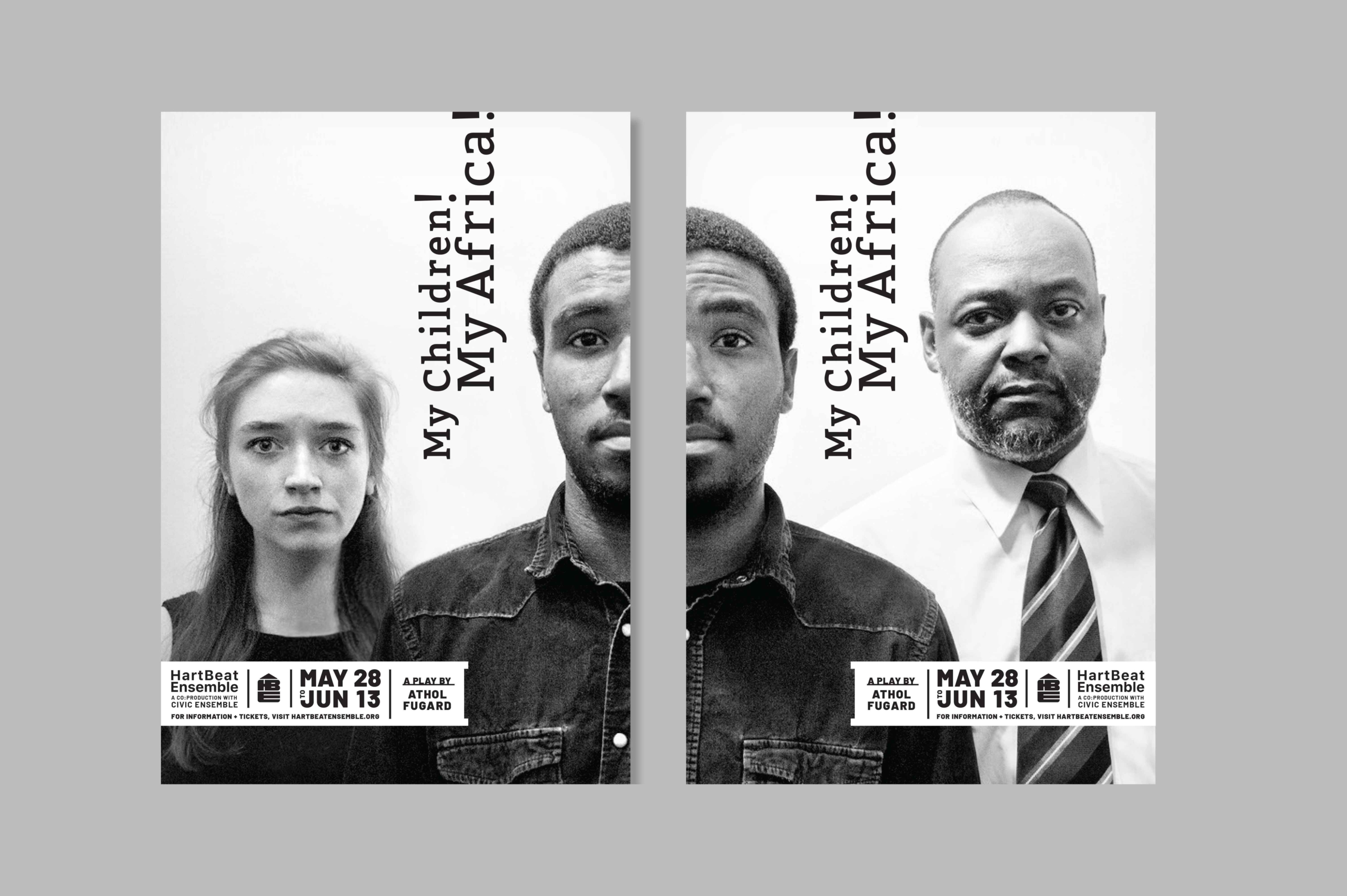
This is an example of the typographic sensibility of brief display content for HartBeat Ensemble.
