01 | Mission
Mental Health Connecticut’s mission is to partner with individuals, families, and communities to create environments that support long-term health and wellness.
We envision a world where well-being is rooted in respect for the condition of being human, where labels are no longer applied to people and services are delivered at the level of humanity, where the general public accesses support when they need it, and where policy-specific advocacy brings about these cultural changes.
02 | Brand Context
Duty / Enlightenment / Justice
(in the context of Community)
Our work aligns with and promotes a sense of DUTY—not just to others, but in the form of personal responsibility for ourselves. While the individual and personal benefits of duty are numerous, rising to the top is the recognition that personal responsibility creates an intentional environment for a cascade of ENLIGHTENMENT. Time and time again, our faith in the collective known as the human condition has shown that enlightenment is a critical portal to the JUSTICE we seek. Thus, we are committed to a place-based, tangible, human-centered approach that is our contribution to achieving the respect, care, empathy, and empowerment that is at the heart of what our COMMUNITY imagines for itself.
03 | Brand Goal
Ensure the Mental Health Connecticut brand feels inclusive, participatory, welcoming and helps the viewer believe the abstraction of community-wide well-being is tangible.
04 | Logo
The Mental Health Connecticut Logo represents a community in various states of wellness: the more secure, the fragmented, and the parts reaching out for support—all integrated and creating a true sense of who we are and the phases we move through on our journey to healing. It implies the map of a community not based on the relativity of streets, buildings, and landmarks, but rather, on the energetic inter-relationship of the people that make up the communities we coexist in. The logo is a piece of beautiful abstract art and can be scaled up for dramatic effect. Have fun with it, but do follow the rules below so the integrity and “aliveness” of the logo can grow stronger over time.

Icon Construction
Our logo is based on three simple type-based shapes carefully crafted for legibility at any size on any application.
Logo Clearspace
Clearspace around the logo is equal to the cap height of the letter “e”.

Stacked Logo
This version works best when the logo stands alone with ample space around it. For example: this would be the best option to use on a tote bag or t-shirt.

Horizontal Logo
Due to its more contained presentation, this version works best on a grid where it must relate to other elements in close proximity.
Logo Clearspace Exceptions
The logo placement depends on the type of communication and use.
Application icons
Social media icons
Stacked Logo Scale
Smallest size: for web: 160 pixels wide / Smallest size: for print: 2 inches wide.

Horizontal Logo Scale
Smallest size: for web: 225 pixels wide / Smallest size: for print: 2 inches wide.

Logo Color
The logo in color or grayscale should be placed on white or light background like the one shown (Black at 8%).


Logo Guidance

Don’t stretch the logo.

Don’t change the logo colors.

Don’t rotate the icon.

Don’t use other fonts.

Don’t break apart or rearrange the MHCT icon.
Sub-brand Approach
We define a sub-brand as program/content organizing nomenclature that sits hierarchically immediately after the mhc brand. If the mhc brand is rooted in what we are working toward, the mhc sub-brand becomes the main ideas that we are working on.
Think about it this way: if the organization were an outline for a presentation, mhc would be the title, theme, or overview of the presentation and the sub-brands would be the next level down: the topics we will discuss that demonstrate how we deliver on the promise the brand makes.
The tertiary points, if any, help to flesh out the sub-brand. To avoid confusion, tertiary points that exist within the sub-brand should never occupy the position of sub-brand in the mhc visual representation.
We are building brand equity. To that end, “mhc” is being heavily leveraged both in our visual identity and our written and colloquial usage. Tactically: Sub-brands will always be used in the context of the brand—especially in the initial brand awareness phase by starting each sub-brand logo in a rounded-corner box in MHC Blue, Green, or Orange. rounded corner graphics are paired with the sub-brand name in 85% Black (MHC Gray /Roboto Medium) and a tagline, “A Program of Mental Health Connecticut” (Special Gray / Roboto Regular).
Sub-brand Heirarchy
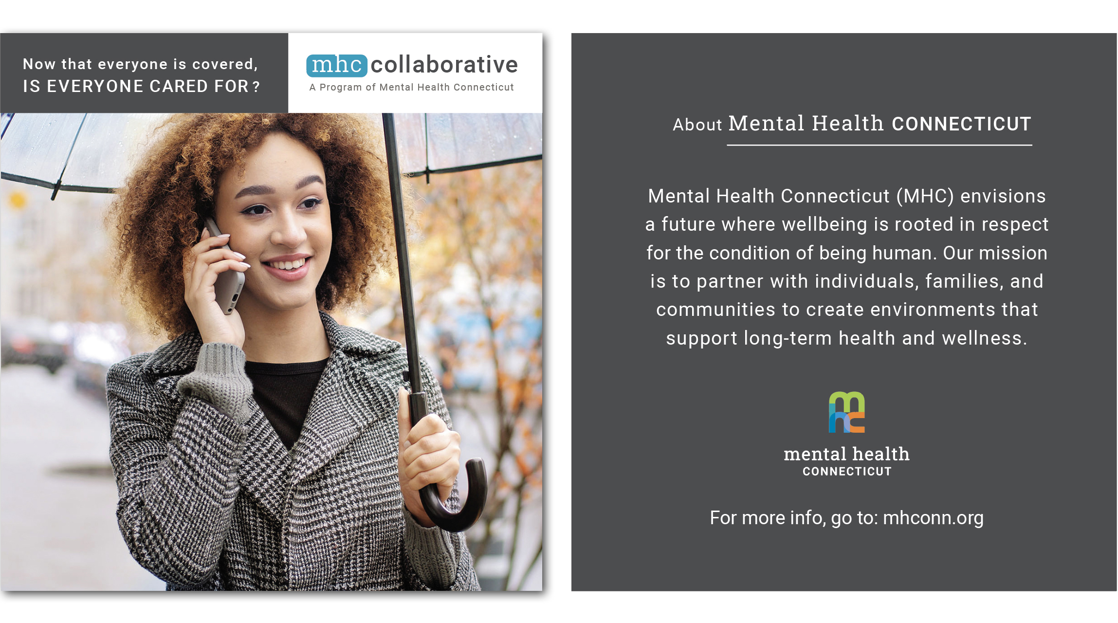
This is an example of the sub-brand in a layout. The sub-brand logo takes the position of the main logo. The main logo appears as sign-off on the back. The main logo “mhc” icon only can appear with the sub-brand on printed materials. In that instance, it would be placed at the bottom center of the front cover (in the example of a brochure).
Sub-branded Program Heirarchy
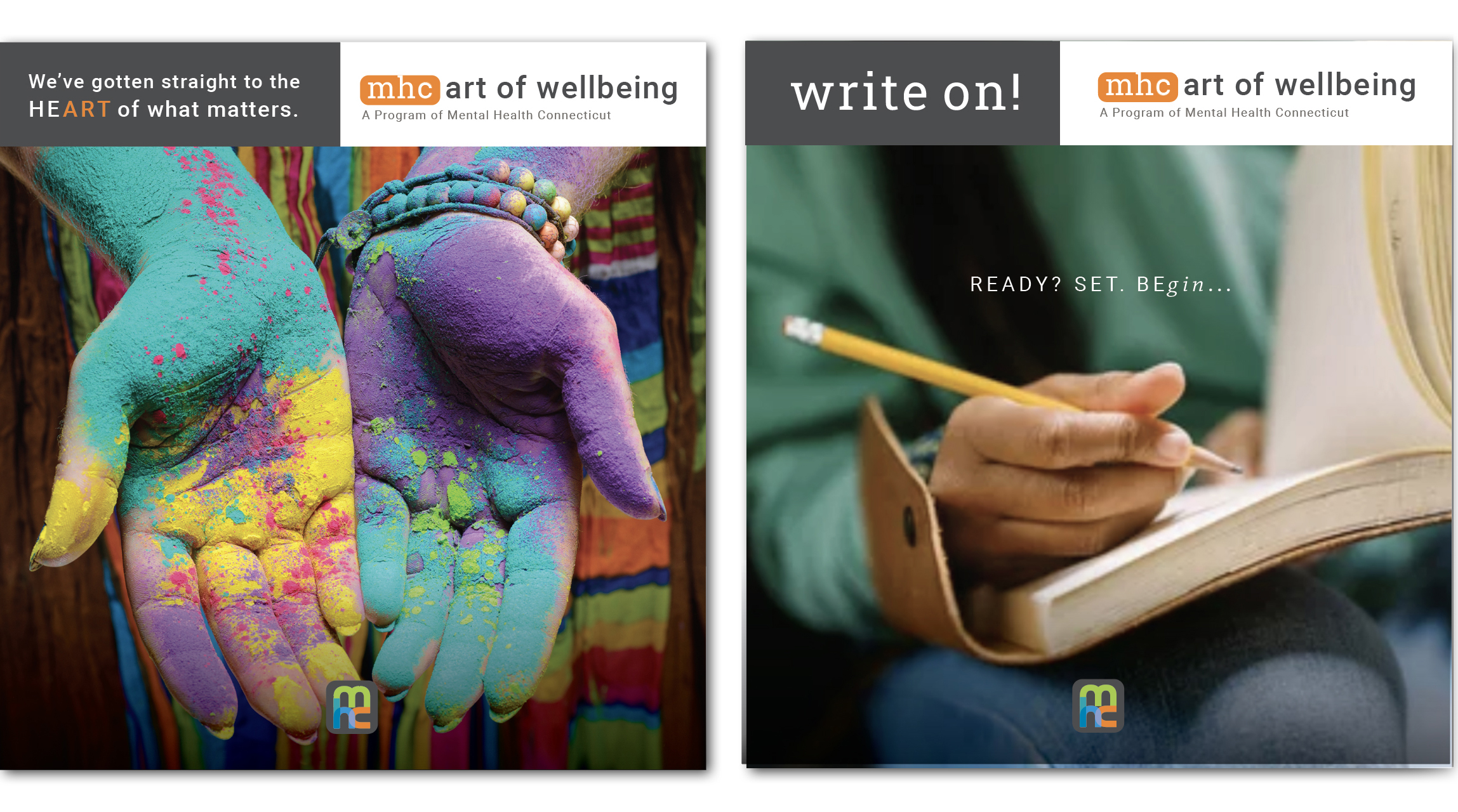
The example to the left is the sub-brand in a layout with the main logo “mhc” icon appearing at the bottom center of the front cover of a brochure. By comparison, the example to the right is the layout treatment of a sub-brand program. Note the hierarchy of the 3 branding convention: priority position is the program, secondary position is the sub-brand, tertiary position is the MHC brand.
Sub-brand Logos
05 | Brand Colors
The brand colors provide accessibility, simplicity, and consistency throughout all brand communications.

RGB 65 173 73
CMYK 75 5 100 0
HEX 40ad48

RGB 4 158 191
CMYK 78 20 18 0
HEX 049ebf

RGB 245 130 32
CMYK 0 60 100 0
HEX f5821f

RGB 77 77 79
CMYK 0 0 0 85
HEX 4d4d4f
06 | Typography
Roboto
This headline is three lines and set to Roboto Bold 700.
This subhead is half the point size of the headline and set to Roboto Medium 500.
The Body Copy is set to Roboto Regular 400—Roboto is a neo-grotesque sans-serif typeface family developed by Google as the system font for its mobile operating system Android, and released in 2011 for Android 4.0 “Ice Cream Sandwich”. The entire font family has been licensed under the Apache license.
Roboto Slab
This font is Roboto Slab Normal 400 and it is to be used for headlines.
07 | Brand Examples
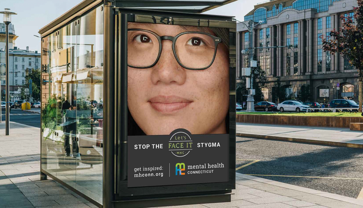
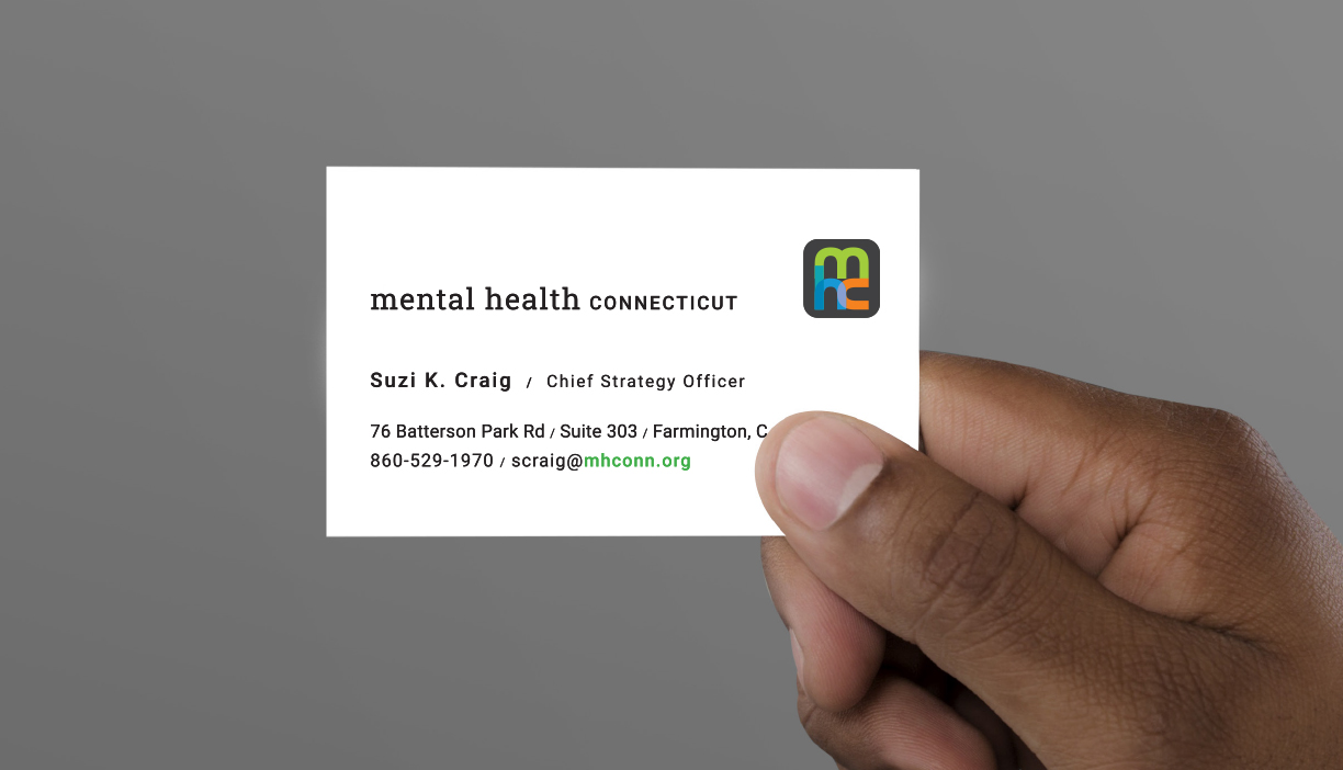
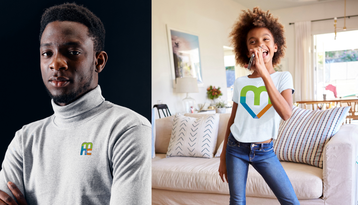
Brand Tone
