01 | Mission
Statewide Legal Services of Connecticut is a dedicated and experienced group of professionals working to provide assistance to eligible people seeking help with legal problems affecting their most fundamental rights.

02 | Brand Context
Equity is the goal of SLS: the doctrinal goal is to make clients whole.
What we want to see more of in the world and therefore what we are working toward. JUSTICE is the central value of the organization. VALIDATION—our clients are worthy of support and being being met with “yes you can” encouragement. ENLIGHTENMENT is the prevailing attitude that shares knowledge with dignity—it’s our approach to educating clients. Our staffs’ work ethic is grounded in a sense of DUTY where we are all committed to a culture where our clients’ sense of SECURITY is honored. And we acknowledge that we all are entitled to the opportunity to ask for and to work toward REDEMPTION—it’s our personal declaration in our equity work.
03 | Logo
There are two versions of the SLSCT logo: The marketing-centered logo and the seal logo.
The marketing-centered logo should be used on all marketing materials as it is easier to scale and ties into the intention of presenting SLSCT as a technologically progressive and customer-centric trusted brand.
The seal logo should continue to be used on business papers (business cards, letterhead, etc).

Marketing Logo
This logo is based on a composite of the official logo components with adjacent typography in Berthold Akzidenz Grotesk, Bold.
Logo Clearspace
Clearspace around the logo is equal to the cap height of the letter L.
Logo Guidance

Don’t stretch the logo.

Don’t use other fonts.

Don’t change the logo colors.

Don’t pair the logo with marks other than the one provided.

Don’t reorganize the logo lock-up.
Seal Logo
This logo is the root mark that provides the components for the marketing logo. Treat it like a seal to officiate business papers and other formal documents and signatures.
04 | Brand Colors
While our logo has an illustrative color range, our design palette is intentionally restrained to coordinate well with our partner programs.

MAIN GRAY
RGB 81 81 81
CMYK 05 04 06 80
HEX 515151

MAIN GREEN
RGB 126 165 72
CMYK 58 20 97 0
HEX 7ea548

TINT GRAY
RGB 232 229 224
CMYK 0 0 3 10
HEX e8e5e0

TINT GREEN
RGB 218 224 214
CMYK 14 06 15
HEX dae0d6
05 | Typography
Our type options are as restrained as our color palette. This provides us with a strong, confident, trustworthy presentation. That assurance is what our client’s are looking for in times of trouble.
Print Font: Berthold Akzidenz Grotesk
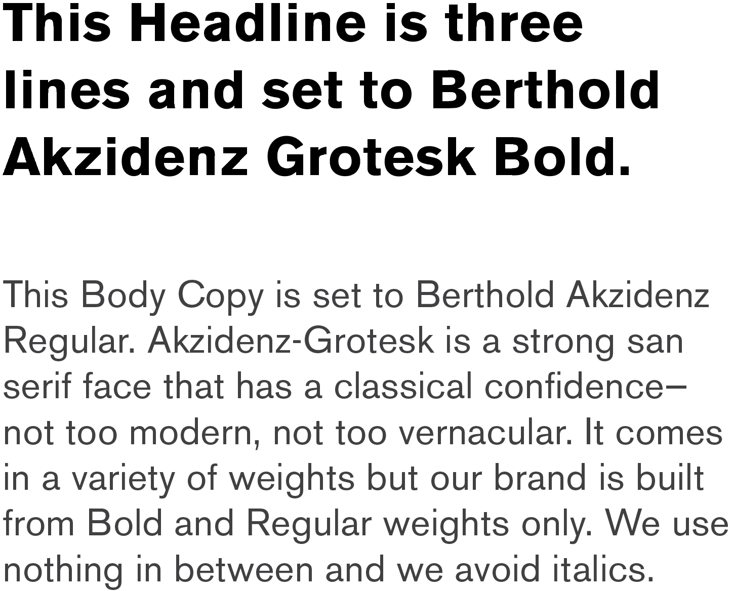
Web Font: Inter
This Headline is set to Inter Bold 700. Inter is a free Google Font Family.
This subhead is half the point size of the headline and set to Inter Semi-Bold 600.
The Body Copy is set to Inter Normal 400. Inter is a variable font family carefully crafted & designed for computer screens. It features a tall x-height to aid in readability of mixed-case and lower-case text. While there are mani weights of Inter, we are limiting our options to Bold, Semi-Bold, and Normal.
06 | Tone of Voice
We aim for plain speak and brevity. Our goal is to make our information digestible and our process to access help simple.
The following is a simple system for providing helpful, linear content and building trust.
- Headline helps readers identify themselves and circumstance.
- The subheadline lets readers know what you will do—even if it’s simply support.
- The first paragraph builds trust that you can indeed do what you promised. It provides the credibility readers need in one or two sentences. Then, it provides details about the help you will give or criteria in an easy to digest manner:
–> What you provide or criteria, first point
–> This is the second point of what you will provide
–> Maybe there is a third point (there usually is). - A call to action is the last point to communicate. The goal is to motivate with some urgency. Try for just one call at a time—absolutely no more than two options of what to do next.
- Signature: Logo / Where to go for more info (a call to action is not “for More Info go to…”)
- Disclaimers or conditional content. Who qualifies? Availability? All of the legal, programmatic issues that folks need to know. Set it apart from the above so the reader doesn’t disrupt their momentum.
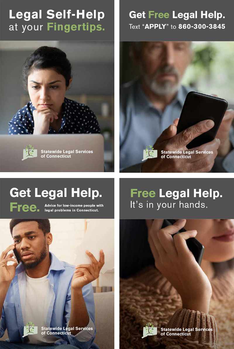
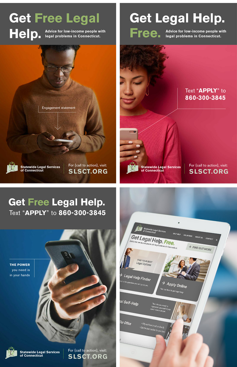
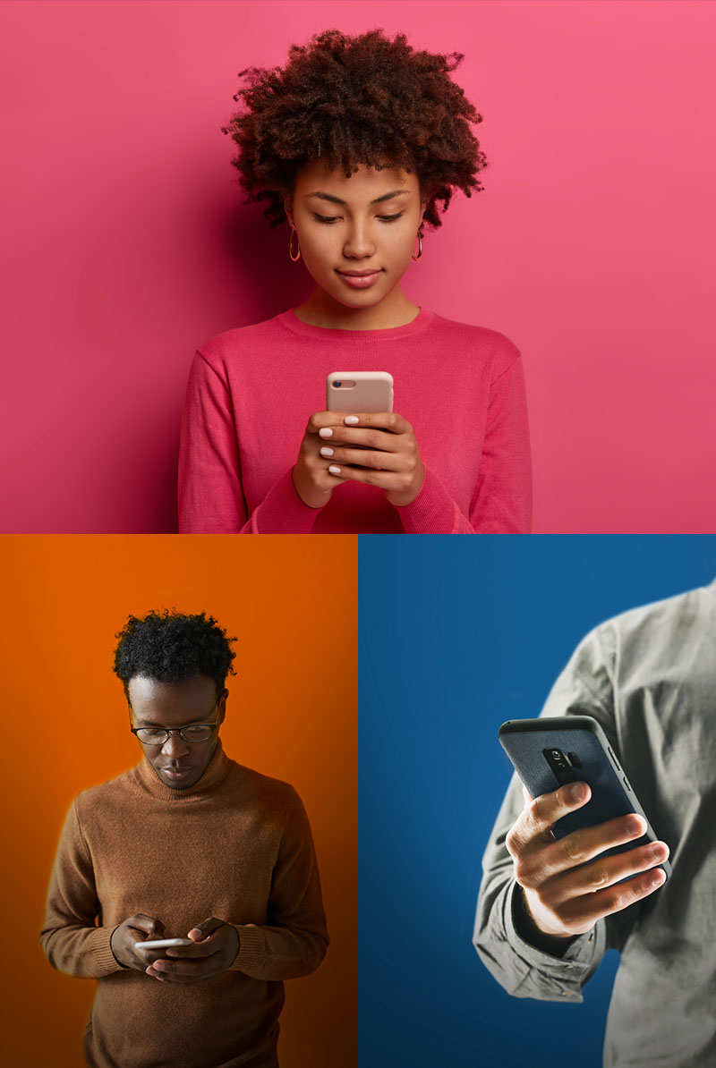
07 | Photography
Our image strategy is simple: For “attention grabbing” distance pieces, we use graphically strong, color-rich images that demonstrate the user confidently connecting with SLSCT. for captive audiences, our images can be more nuanced—they become images in real life where we can tell stories, relate to the reader/users experiences, and describe a process using relatable photography.
Attention-Grabbing Examples:
Captive Audience / Real Life Narrative Examples:

08 | Brand Examples